Have you heard of Prezi yet? Prezi lets you create amazing-looking presentations. Forget PowerPoint and Keynote! Prezi is infinitely more stylish with its endless, slide-free canvas that transition between ideas using barrel rolls, dips and twists.
I saw my first Prezi presentation as part of TED talk movie. I barely remember the topic of the talk, I was so mesmerized by the WAY that it was presented. (OK, so maybe that’s not the desired goal of the speaker, but I tell you – it was memorable!)
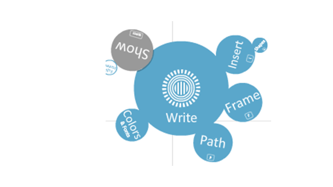
I signed up for an account, and started trying to make my own Prezi. The online interface is simple: Use the buttons shown on the left to “Write” your text, “Insert” graphics and shapes, change “Colors and fonts” of your presentation, add circular and other “Frames”. When you’re done adding content you choose “Path” to show how you want your presentation to flow.
And then you’re ready to click “Show” to share your masterpiece.
Once you’ve got your Prezi ready, you can put it on autoplay and ScreenFlow it to create a dynamic video of your presentation.
Here’s a simple Prezi I made and ScreenFlowed:
If you’re looking for a way snazz up your Keynote presentations, take a look at Prezi.


REally cool, I’ve been thinking about this for a while. I think you can even do a full “typography” video similar to the ones that are a current trend in Youtube. look up “typography song” or typography video. This kinda reminds me of some of them… and no hassle of a million layers and painful hours of work in Photoshop Effects.
Pingback: Create astonishing presentations with ‘Prezi’: « "It's Elementary, My Dear Watson!"
Hi Lynn. I actually had a look at Prezi a couple of months ago and was initially excited about using it in a screenflow project, however… You know what? I got a sick (nauseous) feeling when working with the Prezi project. The spinning visuals had the same effect on me that some video games do, and I simply had to stop and thus could not complete it. Too bad, cause I really think it is a neat presentation tool.
Marty
Hi Marty
Wow, I guess those barrel rolls and dips and turns can induce a sort of motion sickness. I had never considered that. However, what I really love about Prezi is the endless white canvas, the fact that I’m not constrained by a landscape-oriented slide.
Thanks for your insight (and sorry if I made you sick with my little video 🙂
LoL… no Lynn not yours. It was rather mild. It only affected me when I was working on my own and then playing it over and over for revisions. Actually, looking into this a bit more, Prezi does give some recommendations in designing your Prezis to reduce motion sickness on their website, so at least I can confirm I am not the only one effected as such!
This is a great way to avoid Flash!
This is cute, but that’s about the best I can say for it.
The purpose of a presentation is to give information, and if the audience is focusing on the “glitter” and not on the content, then you’re wasting your time — and theirs. Just as Hollywood learned many years ago not to use dissolves and other visual gimmicks unless they were called for as a part of the communication (i.e., a dissolve indicates a change in time or location), a good presentation should not use visual tricks just for the sake of the trick.
Rather than focusing on gimmicks, let’s find ways to use PowerPoint or Keynote to communicate more effectively. A couple of good starting points are Garr Reynolds’ “Presentation Zen” and Nancy Duatre’s “Resonate.” They will quickly lead you away from the traditional bullet point slide (frequently serving more as a teleprompter for the presenter) and lead you to simple combinations of graphics and text that really communicate. I’ve been using and teaching Reynolds and Duarte with great success. They help make the presentation memorable for its content and not for its glitter. That’s what it’s all about, isn’t it?
Here’s another on-line presentation service that should be screencastable in the same way as Prezi. It’s called “dipiity” and it’s a freemium interactive 2D Time Line. You can find it here: http://www.dipity.com/
Check out the examples, especially the Steve Jobs timeline. I was very impressed.
There are lots of on-line presentation tools but most of them are not better than Keynote or Powerpoint and, so, are not worth the extra trouble of screen casting a web site. However, these two do things that neither Keynote nor Powerpoint can do and that’s what makes them so attractive to screen casters like us. Of course I still like Bee Docs Timeline 3D application which is well worth the $65 purchase price. Screencasting dimity is, of course, free unless you have to purchase the premium version to get the extra features and capacities that entitles you too.
Hi,
Your article is very helpful. I created a Prezi and used Camtasia Studio to screen record it, however the final product was quite sketchy, and I couldnt find a way to make the transitions within Prezi fluid, and ‘zoom’ properly. I will try ScreenFlow. Are you able to provide me with the settings that you selected, so that I can ensure it captures as smooth as your example above?
Thanks
Excellent bit of specifics!